


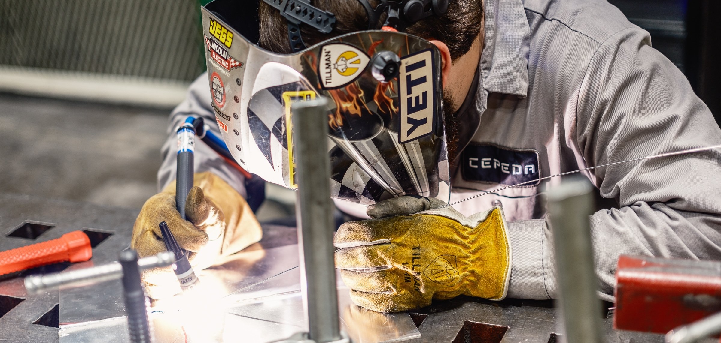
CEPEDA Associates, Inc. is an engineering and manufacturing company specializing in providing service and equipment to the U.S. Navy. For this project, I developed a brand identity that reflects their commitment to precision, reliability, and innovation in defense engineering. The design balances a strong, industrial aesthetic with a modern, professional feel, ensuring their brand stands out in the defense industry.

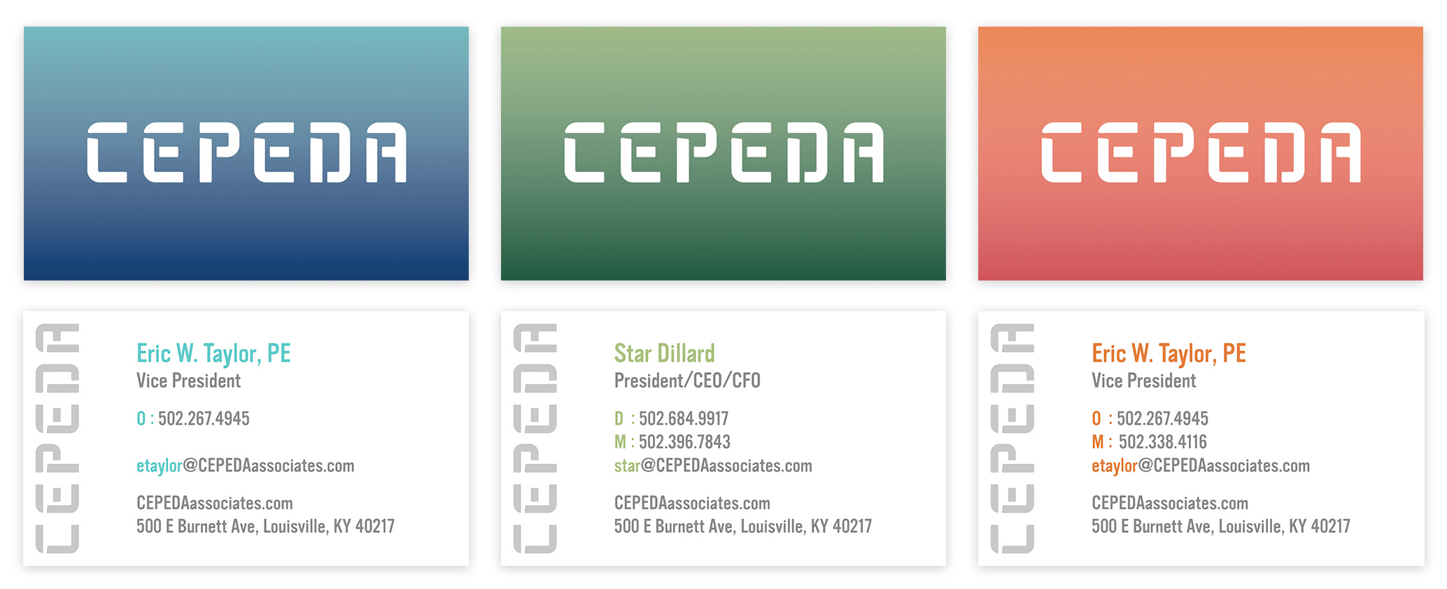

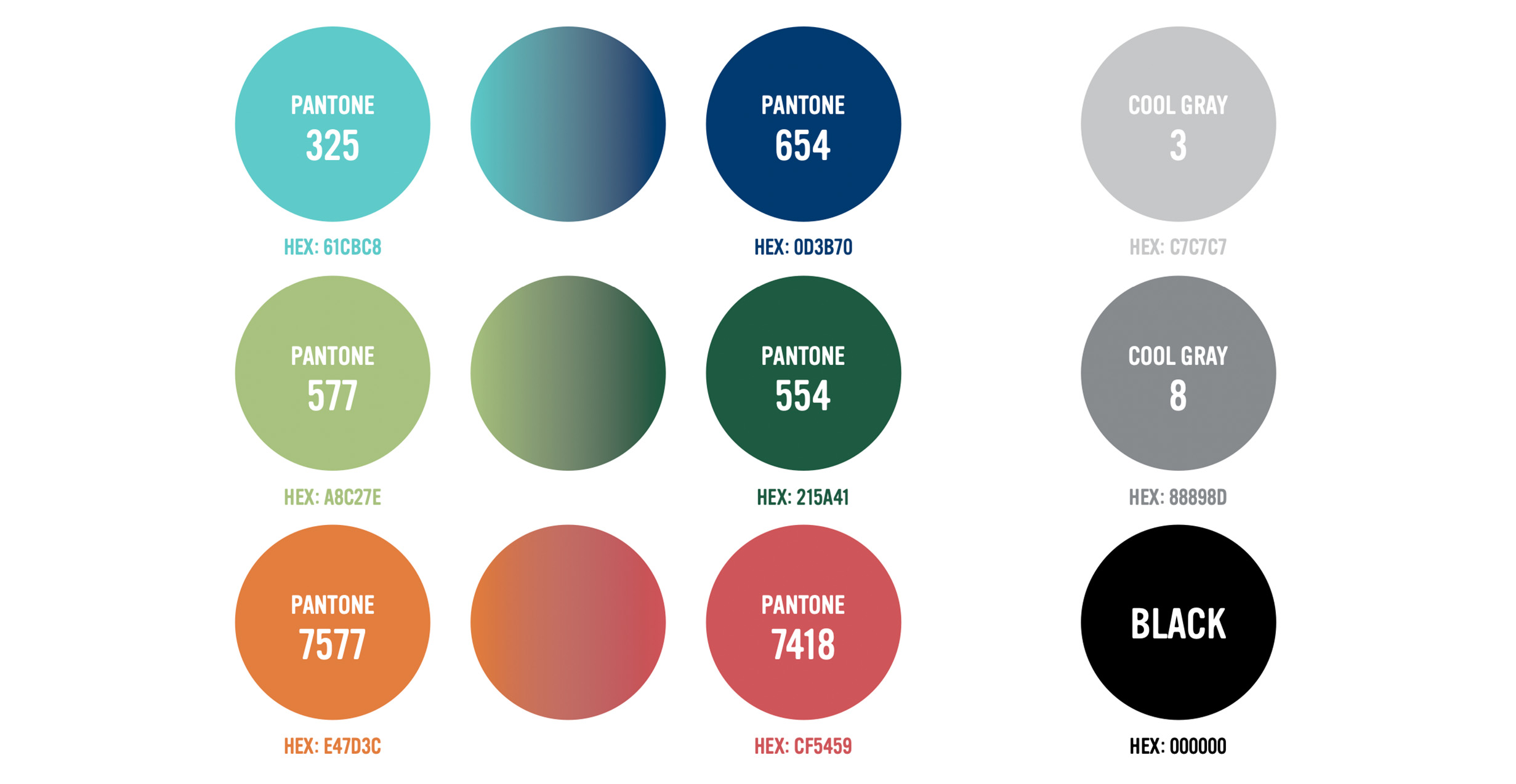
For CEPEDA Associates' business cards, I explored a color palette of blue, green, and orange, each chosen to convey a distinct aspect of their brand. Blue represents trust, professionalism, and their strong connection to the U.S. Navy. Green reflects innovation, engineering precision, and sustainability in their manufacturing processes. Orange adds an energetic contrast, symbolizing forward-thinking solutions and bold leadership in the defense industry. These options provided a dynamic yet cohesive visual identity that reinforced their brand values.




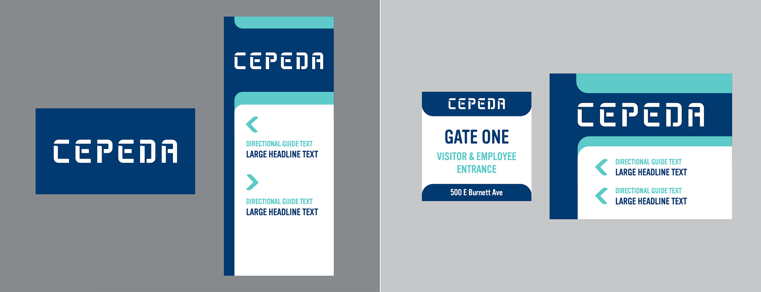

As part of CEPEDA Associates' branding, I designed signage for their Louisville headquarters, ensuring a professional and impactful presence.

